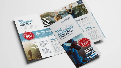
Flyers are one of the simplest tools to spread the word about your business. Even in this digital world, an appealing flyer can travel fast. However, just like any other marketing tool, they work best if they are designed thoughtfully.
In this blog, we will take a look at the most common custom flyer printing mistakes you need to avoid. So, let’s dive in.
- Creating Flyers That Blend In
When your flyer looks like every other business flyer on the wall, your target customers will fail to notice it. This, however, doesn’t mean that the flyer design has to be complicated. Your goal should be to make it look different enough to ensure a second glance. A robust headline, a breathing layout, and clean visuals make all the difference. A creative or thoughtful design for the custom die cut flyers doesn’t have to be fancy; it simply has to be intentional.
- Using Poor Quality Images
If the images if you have chosen for your die cut flyer printing are grainy, blurry, or stretched, it makes it look unprofessional. Using a high-resolution, clear image can make your flyers look professional and trustworthy. Even one strong visual is more impactful than multiple smaller ones. Choose images that are at least 300 dpi. Anything lower than this runs the risk of fuzziness. Often, people assume that upscaling can solve the issue, but software cannot create detail that is not there. So, it is better if you choose high-resolution photos for the beginning.
- Overcrowding It with Too Much Information
Sure, you might be tempted to explain everything about your business or offer in your die cut flyer, such as the contact information, slogan, or product or service list. This can lead to a visual overload. Your target customers will fail to understand where to look, and cause the message to get lost. An overcrowded layout is unattractive and undermines communication. The die-cut flyer must work at a glance. It should be simple and memorable. Focus on adding one or two messages.
- Using Hard-to-Read Fonts
Ornate fonts can look beautiful on your flyer, but they can compromise readability. This, in turn, can hamper the effectiveness of the flyer. Clear fonts in a color that is in contrast with the background can make the text easy to read. Your target customer understands it instantly. Your flyer must be readable even if the hallway is dimly lit or outdoors when it is cloudy.
- Selecting the Wrong Paper
Paper plays an essential role when it comes to the feel and look of your flyer. A glossy flyer might be suitable for your promotional materials. Uncoated or matte, paper on the other than can be better for professional documents. Choosing the wrong paper for your flyer printing can have a strong impact on readability and its overall impact. A flyer printing service provides a wide range of paper stocks and finishes to choose from. Don’t hesitate to ask your printing company for recommendations.
- Not Proofreading the Content
Even if your flyer design is highly appealing, it can lose its professional touch if it has spelling and grammar errors. Proofreading your content is a crucial step that you should not skip. A single error can lead to the wastage of your money and time. Make sure that you always review your content. If you can, get a second person to double-check it for you. You can also hire someone to proofread to check for spelling mistakes, incorrect dates, or wrong contact numbers.
- Not Including a Clear Call to Action
An attractive flyer might grab attention, but if it doesn’t have a call to action, your target customers might not know what to do next. Your flyers must guide your target customers towards a specific action, whether it is calling your business or visiting your website. Keep the call to action short and easy to find. Use phrases that are action-oriented. Placing it in a prominent location with large fonts ensures it stands out. A strong CTA can turn interest into action.
- Prioritizing Price Over Quality
Choosing the cheapest printing option might save you money upfront, but it can also reduce the effectiveness of marketing. Poor-quality paper, blurry images, or dull colors can make your flyer appear unprofessional and create a negative impression of your business. Rather than focusing only on the price, it is important to consider the overall value. Investing in high-quality custom flyer printing ensures sharp graphics and vibrant colors. A professionally printed flyer is more likely to grab attention and encourage customers to take action.
also read this – https://globaltrendpoint.com/write-for-us/